
User Research Data Analytics User Testing
UI/UX Design System A/B Testing
UX Writing
WeightWatchers
Redesigning the product recommendation experience to increase acquisition, conversion, engagement and product affinity.
Overview
Project: Redesigning the product recommendation experience to increase acquisition, conversion, engagement, and product affinity.
Company: WeightWatchers, a leading health and wellness brand with 3 million active members and app users, offering nutrition, behavioral-change programs, and GLP-1 medications for weight loss through a tiered subscription model.
My Role: Lead Designer / Design Manager
Problem Statement
The existing product recommendation quiz no longer reflected WeightWatchers' evolving offerings, particularly with its pivot to GLP-1 medications. Key issues included:
Poor conversion rates, high bounce rates, and significant drop-off.
Lack of personalization, leading to a generic user experience that failed to guide users toward the right product.
A visually outdated UI with usability issues, including long-scrolling screens, hidden CTAs, and content-heavy transition screens.
Users found the quiz ineffective at explaining why WeightWatchers was the right choice, undermining trust and product affinity.
Objectives
Improve the performance of the product recommendation assessment as a key conversion funnel.
Enhance UX/UI to deliver immediate value and a more personalized experience.
Reduce user frustration and drop-off by creating a streamlined and engaging quiz experience.
Success metrics
Conversion Rate: Increase the percentage of users who complete the sign-up process after receiving their product recommendation.
01
Completion Rate: Improve the percentage of users who fully complete the quiz after starting it, reducing mid-quiz drop-off.
02
Drop-Off Rate: Minimize the number of users who abandon the quiz at key friction points, especially early in the experience.
03
Completion Time: Optimize the time it takes for users to complete the quiz, balancing efficiency with engagement to maintain trust and comprehension.
04
Research & Analysis
Methodologies Used
User Interviews: Understanding pain points, motivations, and decision-making factors.
Past Research Reviews: Leveraging existing data to avoid redundant efforts.
Customer Insight Surveys: Identifying user expectations and preferences.
Product Analytics & Data Science: Analyzing drop-off points and user behavior.
Competitor Analysis: Benchmarking against industry leaders for best practices.
Usability Testing: Iterating on early prototypes for validation.
Research highlights
User feedback
Users wanted clearer explanations of why a product was recommended.
The assessment lacked personalization, making it feel impersonal and generic.
Long, content-heavy screens increased cognitive load, leading to high drop-off.

UI inconsistencies and poor affordances hindered usability.
Users did not feel engaged or confident in their selection process.


Data analysis
I conducted a thorough analysis of the quiz conversion funnel and reviewed user behavior analytics to identify problems to solve and help inform design decisions.
Drop off
More than 50% of users were dropping off within the first 5 screens, most on the second screen which had multiple input fields. We were also losing users at the email input screen before the final results screen.
50%
Conversion Rate
The quiz had a 16% conversion rate with the highest converting entry point from the pricing page, indicating that high-intent users were willing to take the quiz if they needed more convincing and help picking a plan.
16%
Completion rate
The quiz had a 20% completion rate, with significant drop off from each screen, indicating the 7-min completion time was far too high and needed to be cut down.
20%
Competitor Research
Analyzing competitors provided valuable insights into industry standards and opportunities for improvement.

Foodvisor
Strengths:
Quick & Efficient: Shorter quiz length reduces drop-off risk.
Visual & Engaging: Uses appealing images and simple interfaces.
Primes for Onboarding : Sets clear expectations and value from the start.
Weaknesses:
Limited Depth: Shorter quizzes may lack the nuance of a more comprehensive assessment.
Less Educational Content: Misses an opportunity to reinforce expertise through educational elements.
Lower Commitment: Users may feel less invested due to the quick completion time.

Care of
Strengths:
Visually Appealing: Clean design and friendly visuals .
Multiple Recommendations: Suggesting a range of products increases the chance of conversion.
Engaging & User-Friendly: Simple interactions and smooth transitions.
Weaknesses:
Decision Paralysis: Too many recommendations might overwhelm users.
Lacks Focus: Broad suggestions may reduce the perceived specificity of the advice.
Completion Time: Visual-heavy design may slow down quiz completion.

Noom
Strengths:
Deep Personalization: Allows for highly tailored recommendations.
Builds Credibility: Signals a thorough, science-backed approach.
Increases Commitment: Users feel invested after completing a long quiz.
Weaknesses:
High Drop-Off Risk: Length may deter users.
Overwhelming: Excessive questions increase cognitive load.
Slow Value Delivery: Delayed gratification can reduce engagement.
Design exploration
EXPLORATION ONE
Chat-based quiz experience
Pros
More dynamic and interactive than a static question per screen.
Allows for more contextual responses, where the next message can be based on previous answers.
May feel more like a personal conversation rather than filling out a survey (novelty value)
Cons
May slow completion time while users wait for chat responses
Risk of feeling artificial
May reduce user control and limit ability to change previous responses

Pros
More engaging and fun - Score tracking and instant feedback make the experience enjoyable which may improve completion rates
Encourages learning – Ssers gain valuable insights about nutrition, weight loss, and motivation, making them feel empowered.
Gamified quiz experience
EXPLORATION TWO
Cons
Risk of feeling less serious – If too playful, it may reduce trust for users expecting a science-backed recommendation.
Complex implementation – Requires more design/dev resources to integrate interactive elements effectively.

EXPLORATION THREE
Traditional health assessment quiz
Pros
Builds trust and credibility – A structured, data-driven approach feels professional and science-backed, making users more likely to trust the product recommendation..
Appeals to users looking for a more clinical, credibility-focused experience.
Cons
Less engaging – Standard question-and-answer format may feel too formal or boring, leading to lower completion rates compared to more interactive options.
Higher drop-off risk – If the quiz appears too long or requires detailed inputs upfront, users may abandon it before reaching the final recommendation.
Selected variant
While a gamified quiz could increase engagement and a chat-based quiz could create a conversational feel, Exploration Three, the traditional health assessment quiz provided the right balance of credibility, efficiency, and conversion impact, making it the best choice for guiding users toward the most effective product recommendation.
In exploring ways to enhance the quiz experience, we considered three distinct design approaches, each aimed at maximizing engagement, personalization, and conversion while aligning with user expectations and behaviors.
Validation testing
Insights gathered from validation testing with 10 participants before the AB test launch.


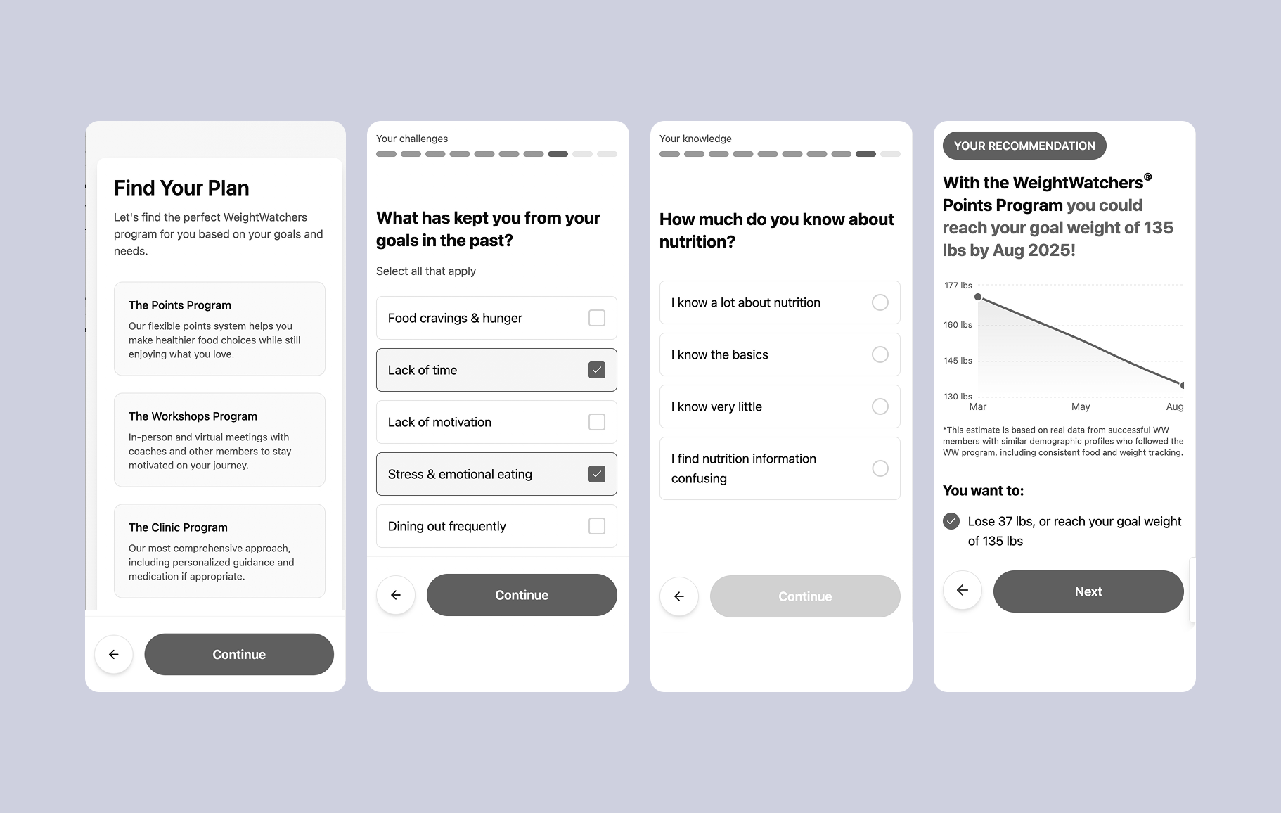
Design Solution
After validation testing with 10 additional users, these final designs were launched as the AB test against the existing quiz. Here are some key design decisions that led us to our high-impact results.

BeforeAfter
User Flow
This flowchart illustrates the high-level happy path as a user completes the quiz, progressing through each topic segment and showing initial personalization branches with potential to scale up, post launch.
Reducing early drop-off, improving completion rates
1. Progressive disclosure on input fields
Reduced cognitive load
Perceived as more conversational
Improved mobile usability
2. Progress bar with sections & progress lines
Gave users a visual roadmap
Kept users more engaged
Set expectations for time to completion

Increasing trust and credibility
1. Using real data to show common goals
Created a sense of belonging and normalizes the goal
Reduced doubt and increased commitment
Leveraged social proof for motivation
Increased emotional connection and sense of community
1. Using real data to show time to goal weight
Set clear expectations and reduced uncertainty
Increased trust with data-backed predictions
Personalized the experience for deeper engagement
Created a sense of progression and motivation
Promoted internal triggers and emotional response

Delivering personalization
Showcasing personalized recipes and weight loss coach matches:
Demonstrated key app features: Highlighted the app's diet and meal planning capabilities, showing users the value of WeightWatchers' curated recipes that aligned with their dietary preferences.
Increase feature awareness: Introduced users to the coaching support feature, making it clear that personalized coaching was an option if they needed more guidance or accountability.
Strategic feature teasing: Instead of pushing coaching aggressively, the quiz planted a seed of awareness, so when users later explored the app, they were already familiar with this value-added service.

Results and success metrics
The redesign significantly improved user engagement and business outcomes:
The test drove a 20% increase in conversion rates
Reduced early drop-off by 45%
The click-through rate (CTR) to the signup page reached 74%.
