
User Research Data Analytics User Testing
UI/UX Design System A/B Testing
UX Writing
WeightWatchers
Redesigning the pre-onboarding product recommendation experience to increase acquisition, conversion, engagement and product affinity.

Project Overview
WeightWatchers is an iconic health and wellness brand with a 60 year history and 3 million active members and app users. The company offers nutrition and behavioral-change programs, as well as GLP-1 medications for weight loss through a tiered subscription model.
Context
The assessment no longer reflected WeightWatcher’s core products as the company pivoted towards GLP-1 medications through a clinical offering.
The experience had been neglected and the growth team had removed entry points into the assessment recognizing the need for major improvements.
This project was determined as Priority 1 for the growth design and product teams on the product roadmap.
Objectives
Improve the performance of the product recommendation assessment, a key conversion funnel, and address poor conversion rates, bounce rates, drop-off and low user engagement.
Improve the UX/UI and offer a personalized experience, delivering users more immediate value and priming them to sign up to the right product.
My Role
Lead Designer / Design Manager
Design Strategy
Stakeholder Management
User Research
Usability Testing
Competitive Research
Data Analysis
Visual Design and Design System
Variant Testing Strategy
Partners
Product Design
Product
Growth Marketing
Content & Branding
Engineering
Data Science
Science and Research
Human Insights
Timeline
Phase One: 4.5 months
Phase Two: 4 months
Design Process
Growth design and experimentation methodology

I followed a growth design process and experimentation framework by first identifying the key business goals, followed by extensive qualitative and quantitative research to uncover opportunities and friction points.
We then ideated and prototyped solutions for validation testing, ultimately launching two final variants to A/B test against the current experience.
Problems to Solve
Business Problems
The business problem to solve was clear from the outset. Our key metrics were suffering and design solutions would be focused on:
Improving conversion rate, CTR to sign-up, completion rates and drop-off rates
Monitoring product mix (which plan and product was ultimately purchased) and the overall impact on Customer Lifetime Value (cLTV)
User Problems
Our users were looking for a weight-loss program and willing to pay for it but found the product recommendation assessment disappointing and unhelpful in choosing the right program for them.
Users felt like the assessment was ineffective at telling them why WeightWatchers would be right for them and the results screen gave no clear explanation of why a product was suggested.
Users were frustrated with the repetitive, content-heavy transition screens, saying they were excessive, distracting and gave irrelevant information.
The UI was poorly designed and visually unappealing with confusing interactions and usability issues including navigation, form errors and long scrolling screens hiding CTAs and other buttons.
Overall users felt their needs were not being considered and the entire experience felt generic.

Impact
Users spent too much time manually searching for the right product across the site and elsewhere.
Users lost trust in the WeightWatchers’ recommendations and considered switching to a competitor.
The lack of clear explanations meant users did not feel confident in a purchase decision.


The previous experience failed to meet user needs and negatively impacted product affinity overall.
Building stakeholder alignment and setting us up for success
Design Strategy Leadership
As the lead designer and manager, I drafted a design strategy for the project to consolidate all requirements, hypotheses, data, and research into a clear, structured framework, ensuring alignment among stakeholders and providing a shared vision for the design direction.
Design Process
Design Hypotheses
“We believe that creating a more personalized product recommendation quiz with dynamic branching that adapts to users' specific concerns, focusing on their challenges and pain points, rather than the brand, we will build greater trust and product affinity. This, in turn, will lead to a more engaging experience, increased confidence in recommendations, and ultimately, higher conversion rates.”
Research Analysis
Gathering all known knowns:
Given the enormous number of users interacting with and completing the product recommendation assessment, and the potential impact that getting the new experience right would have, we knew we had to draw on as many insights as possible to help quickly inform a better solution without a protracted ideation phase. As with all growth design efforts, the emphasis is on velocity and reducing time to learnings.
My growth design process always prioritizes a large lift on early research upfront to speed things up downstream. My personal philosophy on research is:
Evaluative > Generative
Quant > Qual
Take user interview feedback with a grain of salt and be weary of sample size
Unmoderated > Moderated
Competitor research > Reinventing the wheel
Reviewing past research > Starting research over from scratch
Methodologies Used
-
Working with the user research team, we conducted moderated user research sessions with 10 new and lapsed users via UserTesting.com. Participants were asked to complete the assessment and give live feedback along the way in addition to answering specific questions.
-
WeightWatchers had a large library of past analytics reports and user research reports conducted from previous work on the pre-purchase assessment. These reports were rich with still-relevant findings which we could apply to the design strategy,
-
We had a treasure trove of customer research and human insights reports to extract meaningful data from, relating to user’s psychology, motivations, emotional state, goals, struggles, habits and demographics. This data helped inform tone, content and pain-points.
-
Working with our product analytics partners we asked for specific data on most commonly selected answers, time on screens, skipped screens, screen bounce rate, drop-off points, click-throughs, conversion metrics, take rates for recommended products, traffic sources, entry-points and many other parameters. This helped us zero-in on the biggest opportunities to improve key success metrics.
-
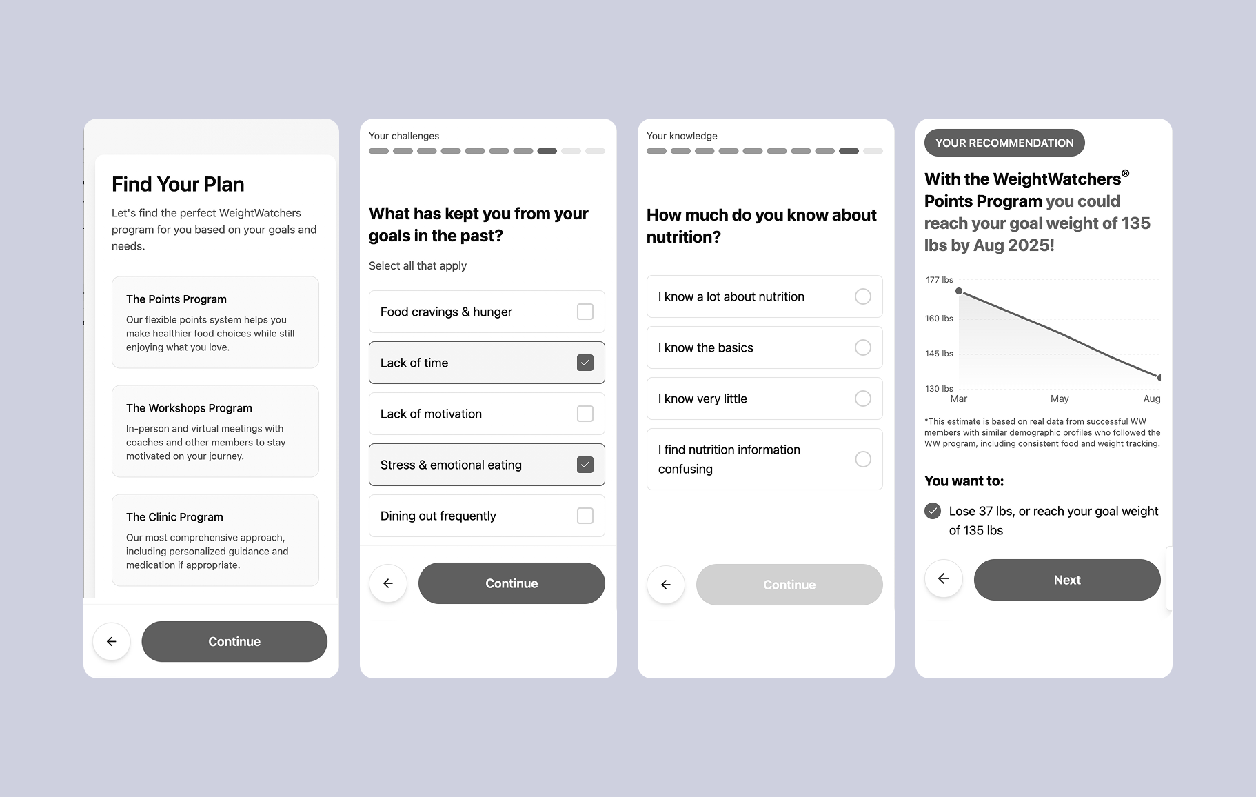
I wanted to find out the most common weight-loss goals of our users to create a dynamic playback screen showing a user where their goal fell on the bell curve of all weight-loss goals. This interaction was achieved by reviewing our user data with data science and building a simple calculator on the back end to present to the user. Similarly, I worked with data science to create a dynamic weight-loss chart estimator which proved to be a major factor in lifting conversions.
-
We reviewed A/B tests which had be done on and in relation to the assessment in the past year, to make sure we weren’t designing solutions around ideas that had been tested and failed previously, and to gain insights into ideas that we already had some positive data indications around.
-
With the help of the design team, I conducted extensive analysis of direct and indirect competitors evaluating for UX and visual design (layout, typography, colors, branding), navigation and interaction patterns (flows, affordances, accessibility), usability pain-points and strong UX patterns.
Examples and Excerpts from Research Outputs.

User interview findings

Competitor analysis Figma

User interview usability fidings

User interview findings

User interview pain-point highlights

Usertesting.com recordings

Product analytics reporting

Stakeholder output on competitor research

Highlevel pain-points for stakeholders
Research Analysis
Reviewing existing experience
Before beginning new design explorations I reviewed the existing experience in the content of all the research insights we’d gathered so far and prioritized key problems to solve.
UI/UX review
UI looks outdated and lacks polish or any visual delight. Little communication is done visually so content-heavy screens increase cognitive load and feel overwhelming.

No visual/graphic progress indicator. Existing progress indicator is also confusing and resets at every new question, never showing how close user is to end of task.
Form errors occur before user has completed input. Irregular spacing and inconsistent layout patterns. Top alignment looks clumsy.
CTAs and getting lost on long-scroll screens. Secondary CTA “I’m ready to Sign-up“ makes the task of completing the assessment seem unimportant and irrelevant. Back button is easily not thumbable.
UX writing doesn’t tell a story or focus on user’s personal experience with weight-loss. Copy length is overwhelming and wordy. Users don’t feel engaged in a responsive dialogue and aren’t getting value from transition screen copy.
Userflow review
The existing experience quiz that did not include branching so failed to create a truly personalized experience, treating all users the same, regardless of their unique needs and concerns.
Without branching, every user went through the same rigid flow, even if their answers suggested they had different needs. This made the experience feel impersonal and generic, reducing engagement and trust in the recommendations.

Research Analysis
UX writing
As with many top-of-funnel experiences, strong UX writing and content was critical to help connect with users emotionally and demonstrate an understanding of their problems and motivations. This project required all new copy and content in partnership with UX writing and the content team. Having an extensive background in writing and content creation, I was able to draft initial copy, which sped the project up significantly by informing the structure of the story and user journey.
The existing experience focused heavily on WeightWatchers as a brand and product rather than centering the story around the user’s problems to solve, their goals and needs. With users at the consideration phase of their purchase decision, we knew we needed to bring a more empathetic, human and user-centered tone to the UX writing while focusing on personalizing copy and content wherever possible.
Bring any disqualifying questions to start of the quiz to avoid users wasting any time.
Ensure all transition screens are related to previous question and answers selected.
Deliver value through copy by sharing helpful statistics and data, educational content and themes associated with the challenges and goals they’re experiencing.

Design exploration
EXPLORATION ONE
Chat-based quiz experience
Pros
More dynamic and interactive than a static question per screen.
Allows for more contextual responses, where the next message can be based on previous answers.
May feel more like a personal conversation rather than filling out a survey (novelty value)
Cons
May slow completion time while users wait for chat responses
Risk of feeling artificial
May reduce user control and limit ability to change previous responses

EXPLORATION TWO
Gamified quiz experience
Pros
More engaging and fun - Score tracking and instant feedback make the experience enjoyable which may improve completion rates
Encourages learning – Ssers gain valuable insights about nutrition, weight loss, and motivation, making them feel empowered.
Cons
Risk of feeling less serious – If too playful, it may reduce trust for users expecting a science-backed recommendation.
Complex implementation – Requires more design/dev resources to integrate interactive elements effectively.

EXPLORATION THREE
Traditional health assessment quiz
Pros
Builds trust and credibility – A structured, data-driven approach feels professional and science-backed, making users more likely to trust the product recommendation..
Appeals to users looking for a more clinical, credibility-focused experience.
Cons
Less engaging – Standard question-and-answer format may feel too formal or boring, leading to lower completion rates compared to more interactive options.
Higher drop-off risk – If the quiz appears too long or requires detailed inputs upfront, users may abandon it before reaching the final recommendation.
Selected variant
In exploring ways to enhance the quiz experience, we considered three distinct design approaches, each aimed at maximizing engagement, personalization, and conversion while aligning with user expectations and behaviors.
While a gamified quiz could increase engagement and a chat-based quiz could create a conversational feel, Exploration Three, the traditional health assessment quiz provided the right balance of credibility, efficiency, and conversion impact, making it the best choice for guiding users toward the most effective product recommendation.
User Testing Analysis
Insights gathered from 10 participants who tested our product recommendation quiz. The data highlights strengths and areas for improvement.


Design
Design Solution
Next I’ll cover the final designs and key decisions made which drove a 20% lift in conversions and made this our most successful launch of the year.
The new experience fixed usability issues, improved the visual appeal and utilized various UX psychology & cognitive bias principles to build trust, reassure and help inform an ultimate purchase decision.

Launch Screen: Addressing drop-off
Given the 50% drop-off occurring on the first screen of the existing experience, we wanted lighten up the design, include member and food imagery to prime people for the questions to follow and explain exactly what users could expect at the end.

Design System Style Guide
I created a style guide for our engineering team and mapped old colors to new colors to update the engineering team’s libraries. We also componentized all new cards, buttons, forms, iconography and custom UI components for our design system.

Usability improvements and goal reinforcement

Affordances and interactions to reduce confusion and drive completion

Personalized recommendations to reflect user’s needs and goals


Showing not telling: reducing cognitive load


Testing
Final Test Variants
This test launched with two different pricing and plans designs, both displaying the estimated weight-loss chart, but with different pricing card designs and feature list designs.
Traffic was split 50/50 with and additional experiment run on social media audiences to isolate a different demographic.

Learning
Results and success metrics
The WeightWatchers product recommendation quiz underwent a major redesign to better personalize the user experience through branching logic, allowing the platform to create distinct user journeys.
This new approach tailored the quiz based on individual user needs, struggles, and goals. By introducing dynamic pathways, the quiz could now ask different follow-up questions depending on the user's initial responses. This personalized flow led to recommendations for specific products, features, and benefits that aligned closely with the user's lifestyle and weight loss objectives.

By providing a more targeted experience, users felt understood, leading to stronger engagement and a higher likelihood of following through with their weight loss journey. The enhanced quiz also improved user activation by delivering clear, actionable recommendations, ensuring that new customers were equipped with the most relevant WeightWatchers resources to help them achieve their goals.

The redesign significantly improved user engagement and business outcomes. The test drove a 20% increase in conversion rates, reduced drop-off, and shortened completion time, making the quiz more efficient and engaging. Additionally, the completion rate soared to 80%, while the click-through rate (CTR) to the signup page reached an impressive 74%.

Post-launch rebrand No.2


After the initial test, the new product recommendation assessment went live globally and we rebranded the experience once again for the launch of the WeightWatchers clinical GLP-1 offering.